Deth & Taxes: A graphic representation
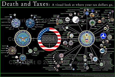
Created by artist mibi, this chart is a visual representation of where our United States tax dollars go. Mibi explains:
After a year in the making... researching, number crunching, layouts, stock gathering, and lots of procrastinating, i am proud to say it is finally done.
Death and Taxes: A visual look at where your tax dollars go.
Most people are unaware of how much of their taxes fund our military, and those aware are often misinformed. Well here it is. Laid out, easy to read and compare.
With data straight from the White House.
I hope this makes people think and ask questions.
Why do we spend more on jets than we do on public housing?
Why is the Endowment for the Arts so small?
Whats with all this foreign military financing?
Im sure you can come up with numerous questions of your own. Unfortunately i dont have any answers. Our leaders do. Your president, his cabinet and your congress person have these answers. Ask them for the answers or better yet, demand them.
(Via Boing Boing)
posted by The Markr at 9:36 AM
![]()
![]()

0 Comments:
Post a Comment
<< Home